Goal
Getting your iOS apps ready for iPhone Duo.
 Source: Apple, via TikTok
Cheat Sheet
Getting Started
- iPhone Duo is out to customers on Oct 23, 2026.
- Apps look different depending on the SDK they’re built against: pre-iOS 27 apps run letterboxed at phone width, iOS 27 apps fill the outer display as a single column, and iOS 27.1 apps use the full two-column width.
- iPhone Duo simulator is only available in Xcode 27.1 beta for now.
- If you want to physically run your app on iPhone Duo, you can attend the Workshop: Optimize your app for iPhone Duo at your nearest Apple Store location.
Layout & Resizing Fundamentals
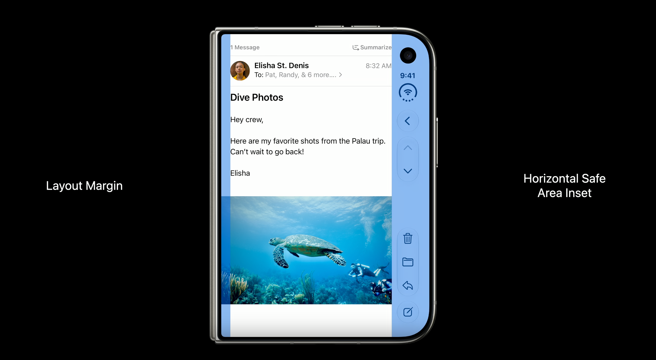
- Align foreground content to the safe area, and let background content go edge-to-edge.
- The iOS 26 Concentricity APIs (
ConcentricRectangle,UICornerConfiguration) let your UI match the device’s actual corner radius.
Bars & Navigation
- If you are using the native iOS components like tab bar and navigation, most of the work is already done for you.
- If you use UITabBar, UIToolbar, or UINavigationBar as standalone views, they remain horizontally oriented and do not receive iPhone Duo’s automatic vertical-axis bar adaptation. To get that adaptation, use the appropriate system container—such as UINavigationController, UITabBarController, or UISplitViewController—and configure its managed navigation or toolbar items.
- iPhone Duo turns Horizontal bars to Vertical. Vertical bars have a fixed width and flexible item height, making them better suited to symbol-only items.
- Use
AxisBehavior(.verticalPreferred/.horizontalOnly) to override how the system decides whether a toolbar item goes on the horizontal or vertical axis. - The ellipsis (…) is reserved for the system overflow menu — consolidate your own overflow actions into it using
ToolbarOverflowMenu(SwiftUI) oradditionalOverflowItems(UIKit) instead of building a custom one. - Disable the vertical bar for bottom-heavy, single-item, or control-heavy apps (like Calculator) using the
toolbarVerticalBehaviorandpreferredVerticalBarBehavior(not yet in Apple’s API reference — see the Raise the bar with iPhone Duo Tech Talk) APIs. - On the inner display, you can present a tab bar as a sidebar via
.defaultTabBarPlacement(.sidebar)in SwiftUI orsidebar.preferredPlacementin UIKit.
Poses & Arrangement Views
- Design around two size classes — compact and regular — instead of building a custom layout for each of the 6 device poses.
ArrangementViewis a new API in iOS 27 for iPhone Duo and it works on a regular iPhone as well.
Reserved Regions & Hinge Response
- Respond to hinge angle and open/closed state with the
onHingeChangemodifier in SwiftUI orUIHingeInteraction(not yet in Apple’s API reference — see the Leverage multiple displays and scenes on iPhone Duo Tech Talk) in UIKit; anullhinge means the device doesn’t have one.
- Respond to hinge angle and open/closed state with the
Multiwindow & Multidisplay
- iPhone Duo is the first iPhone to support multiple instances of your app’s UI.
- New windows can only be created on the inner display — not the outer display.
- If your app is running on the inner display, it moves to the outer display automatically when you unfold the device. If you’re using split-view multitasking, the system promotes whichever app you’re interacting with to the outer display. For the reverse (outer to inner), recently used apps return to where they were; but if it’s been a while, the app that was on the outer display opens full-screen on the inner display.
- iPhone Duo doesn’t support iPad-style Stage Manager multitasking.
- Scene accessories let your app show content on multiple displays at the same time;
CameraCaptureAccessorypairs additional UI on the outer display with your app’s main camera UI on the inner display.
Camera
- iPhone Duo is the first iPhone to support two front cameras.
- Use
builtInOuterUltraWideCameraandbuiltInInnerUltraWideCamerawith the newAVCaptureDeviceDirectionCoordinatorAPI (none of these three are in Apple’s API reference yet — see the Build a great camera experience for iPhone Duo Tech Talk) to manage the transition between the outer and inner cameras.
Migrating an Existing App
- Scene lifecycle (not app lifecycle) is required when linking against iOS 27.
- Avoid referencing main screen (i.e.,
UIScreen.main), it will be deprecated soon. Prefer the environment, trait collection, or the scene’s bounds, and access screens dynamically from the window scene (i.e.,window?.windowScene?.screen). - Replace screen-scale references with the trait collection’s
displayScale, and useregisterForTraitChangeswhere automatic trait tracking isn’t available. - User interface idiom and interface orientation are no longer meaningful for layout decisions — even on iPad or in iPhone Mirroring, your app still runs under the phone idiom, so use size classes instead.
- Xcode 27 introduces a new app modernization agent skill: it automatically converts main screen calls to traitCollection or scene bounds checks, replaces interface orientation checks with size class checks, and converts your app to use scene lifecycle. Export it for use in other tools with
xcrun agent skills export.
Mobile Web (not covered in the Deep Dive below)
- For a mobile web app, you can’t specifically check if it’s a Duo, but there is a standard web API to check if the device has a fold and is folded.
- For the mobile web app experience, you can test your website in Safari on the iPhone Duo simulator.
- For Safari updates on iPhone Duo, they will be available when the new WebKit SDK is out.
Deep Dive
Getting Started
Design Specs
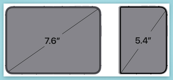
Dimensions: 7.6 (Inner) * 5.4 (Outer)
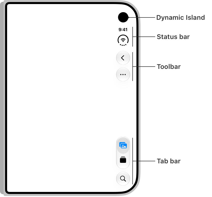
Designing for iPhone Duo tab bar and tool bar:
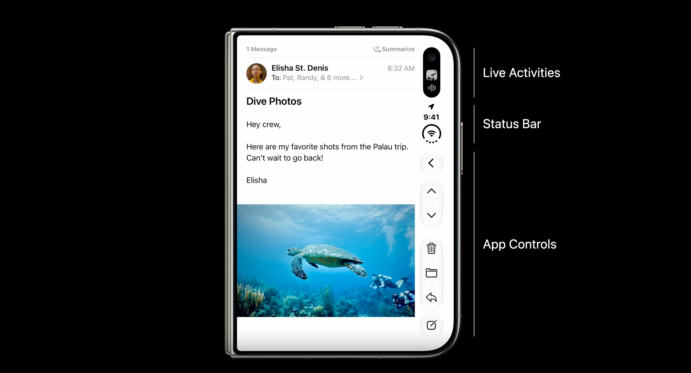
Controls share this vertical space with dynamic elements like live activities and the status bar.
Build your layouts with Layout Margin and Horizontal Safe Area Inset:
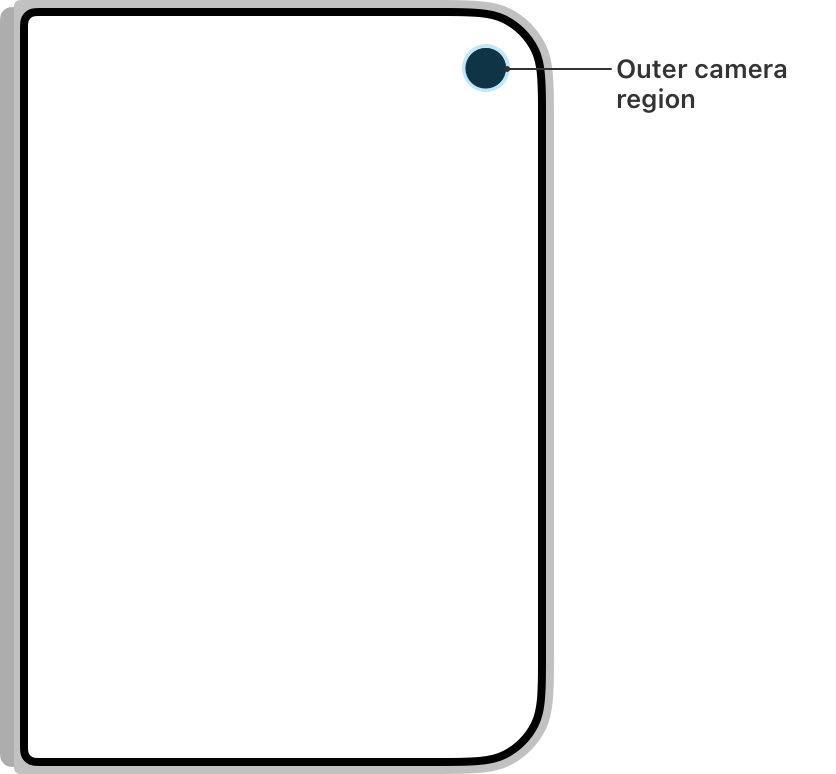
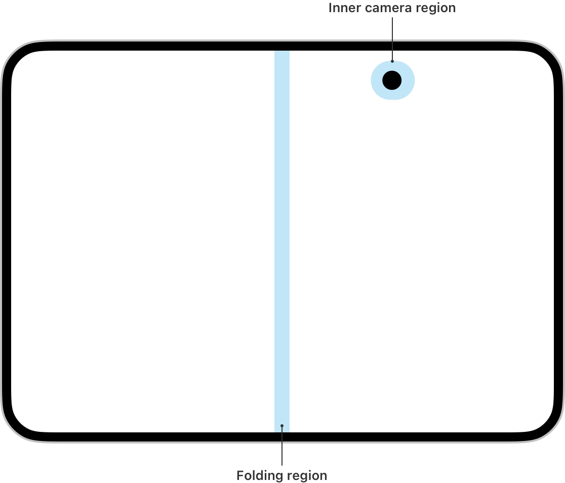
Designing for Hinge and Reserved Regions:
SDK & Simulator Setup
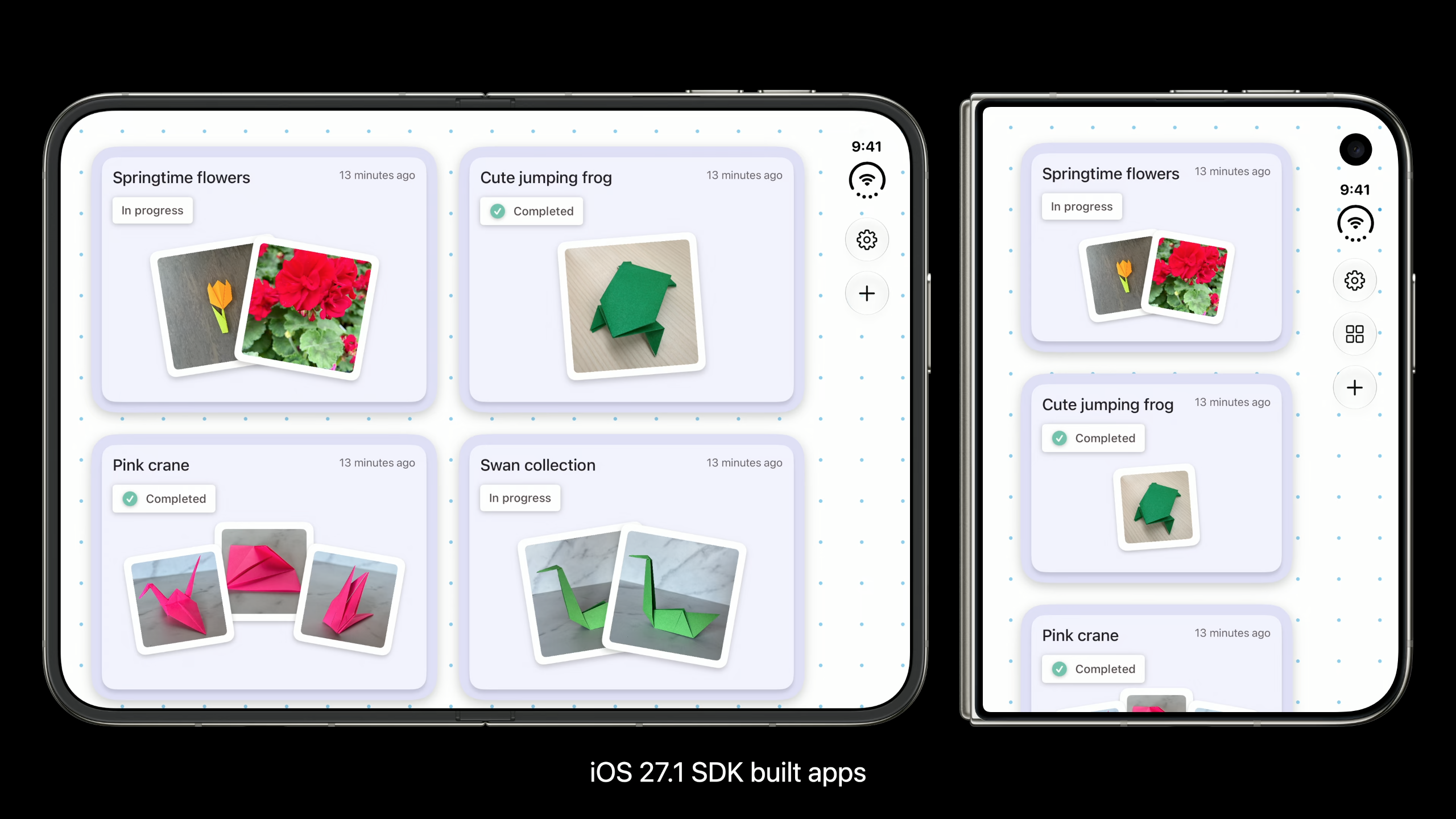
Your app runs on iPhone Duo even without recompiling, and here is how your app is going to look depending on the SDK it’s built for:
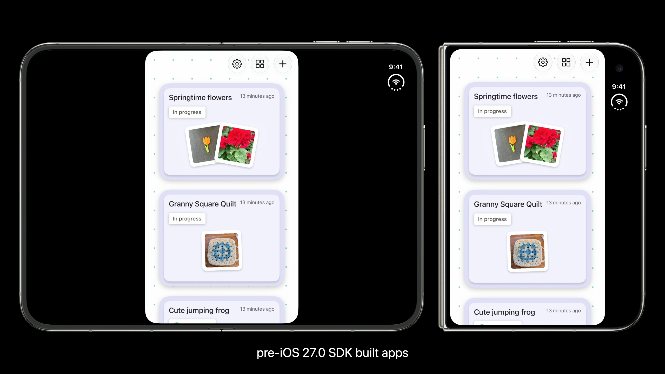
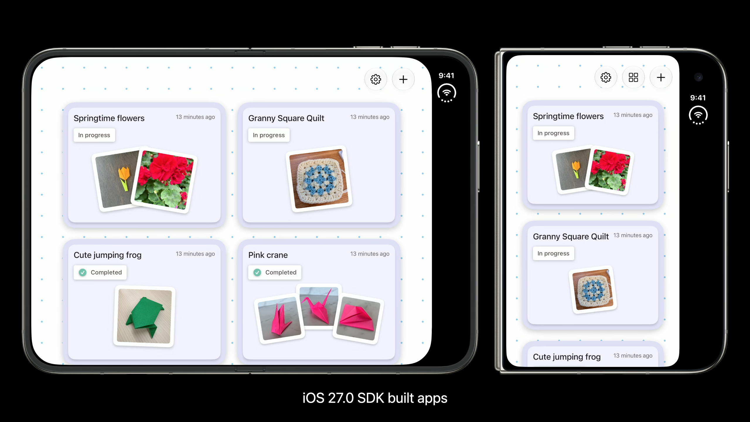
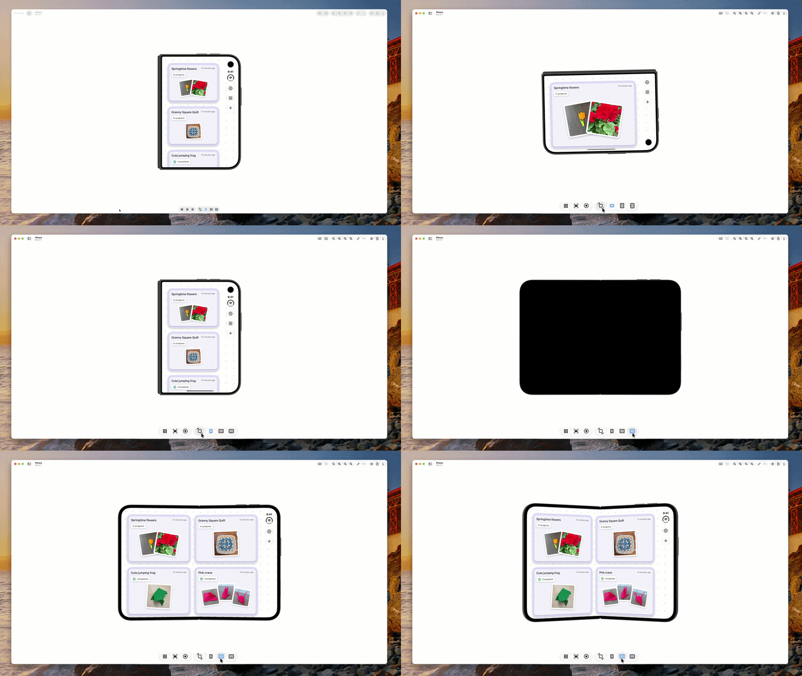
You need to download Xcode 27.1 to run your app in the iPhone Duo simulator using DeviceHub. On-screen control buttons let you open, close, rotate, and fold the device to check your layout in every pose.
Layout & Resizing Fundamentals
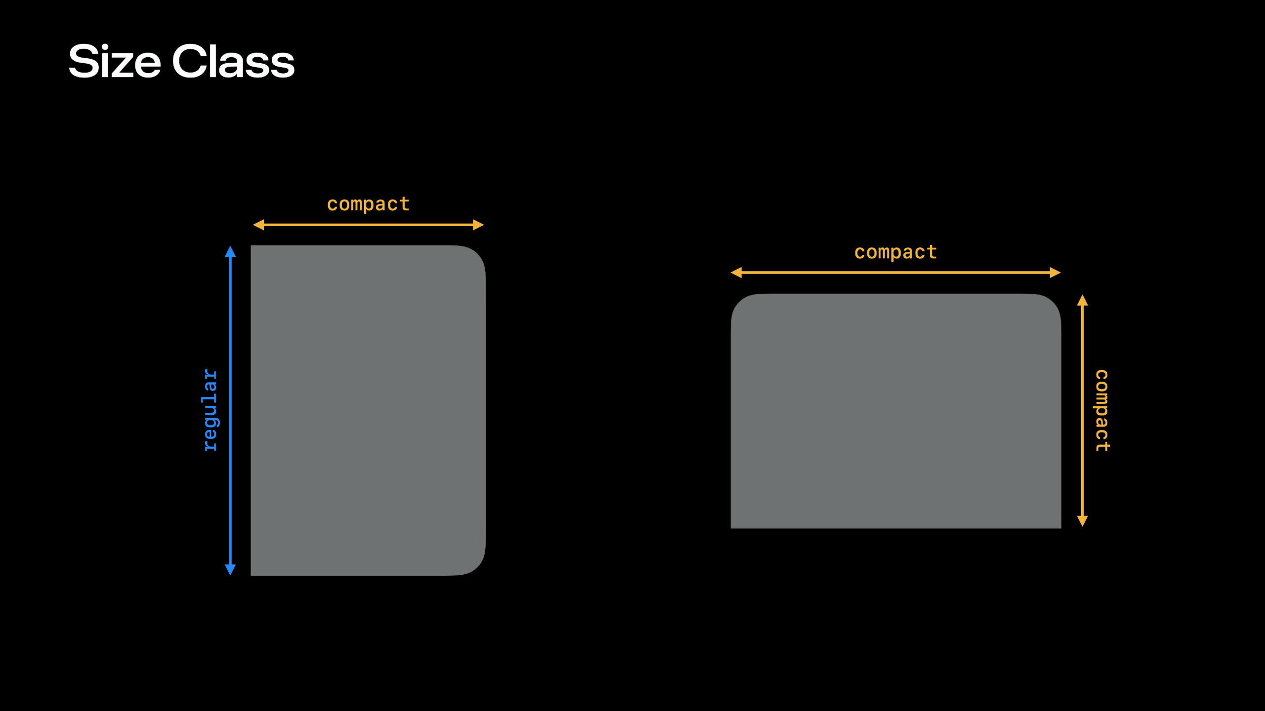
You can add horizontal or vertical layout by using the size classes below —
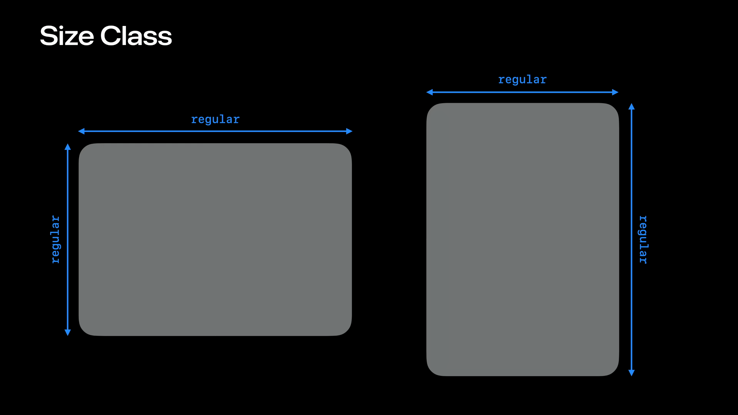
horizontalSizeClass/verticalSizeClassin SwiftUI, orUITraitCollection.horizontalSizeClass/verticalSizeClassin UIKit:// SwiftUI @Environment(\.horizontalSizeClass) private var horizontalSizeClass @Environment(\.verticalSizeClass) private var verticalSizeClass // UIKit traitCollection.horizontalSizeClass traitCollection.verticalSizeClassOn iPhone Duo, there are several size class combinations as shown below:
Outer display honors supported interface orientations, and inner display doesn’t.
To make sure your UI fits perfectly on screen, use the iOS 26 Concentricity APIs,
ConcentricRectangleandUICornerConfiguration, to fit the screen’s corners.// SwiftUI ConcentricRectangle() .fill(Color.green) .padding(8.0) .ignoresSafeArea() // UIKit // UICornerConfigurationFor SwiftUI, your content is placed in the safe area by default. Here is how to position your app to respect and ignore safe area with
ignoresSafeArea(_:edges:):// UIKit foreground.frame = view.bounds.inset(by: view.safeAreaInsets) // SwiftUI .ignoresSafeArea() // UIKit backgroundView.frame = view.bounds
Bars & Navigation
Use System Containers
Rebuild your app against the latest SDKs, then use bars provided by navigation containers.
In SwiftUI, pair the toolbar modifier with
NavigationStackorNavigationSplitView. In UIKit, preferUINavigationControllerandUITabBarControllerover customUIToolbar,UINavigationBar, orUITabBarinstances, whose content isn’t considered.// SwiftUI var body: some View { NavigationStack { ContentView() .toolbar { ToolbarItem(placement: .bottomBar) { ... } } } } // UIKit let viewController = UIViewController() viewController.toolbarItems = [...] let navigationController = UINavigationController(rootViewController: viewController)
Where Bar Items End Up
Tool bar buttons are moved to the top and bottom of the vertical space depending on where they were positioned before:
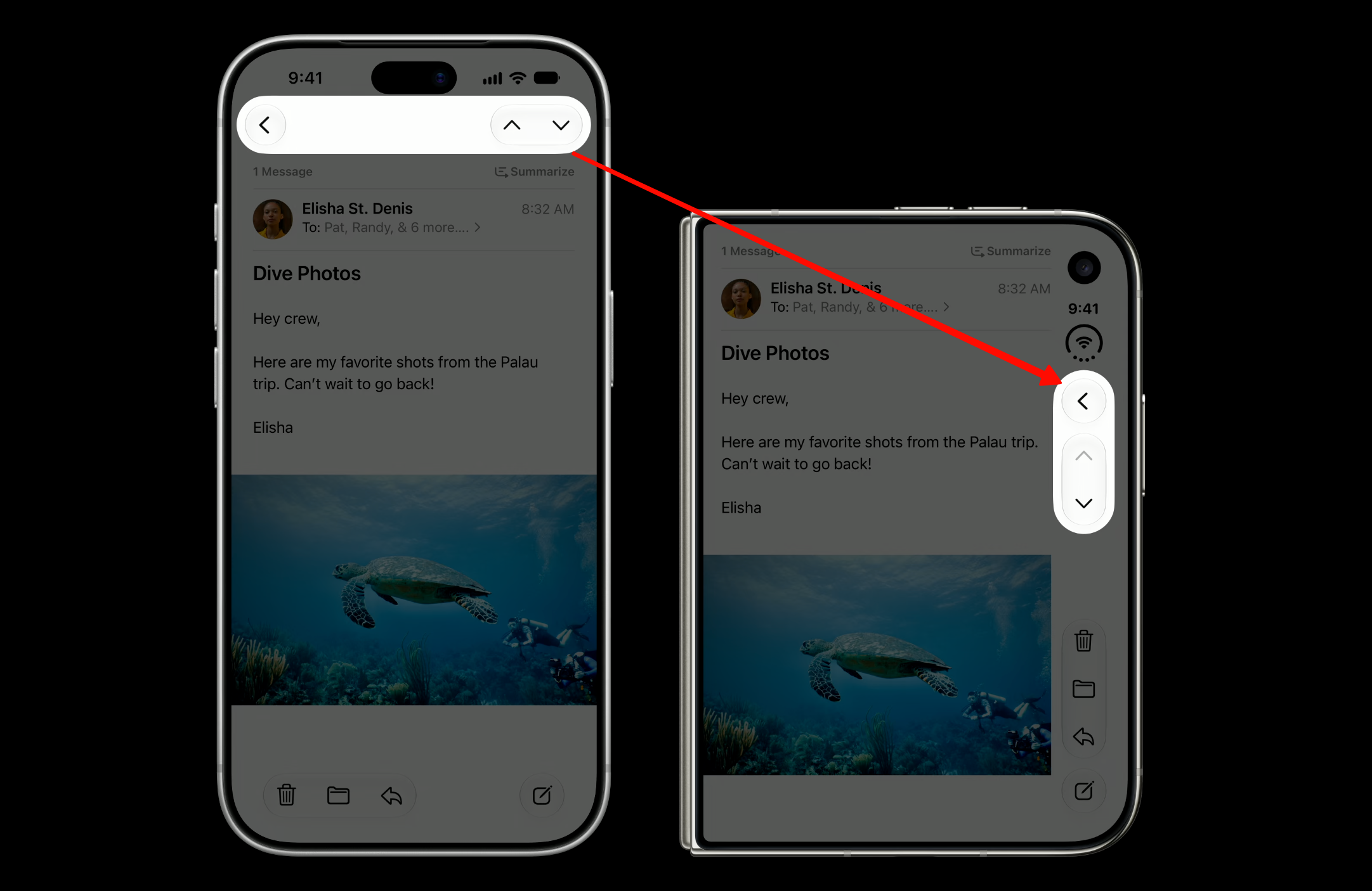
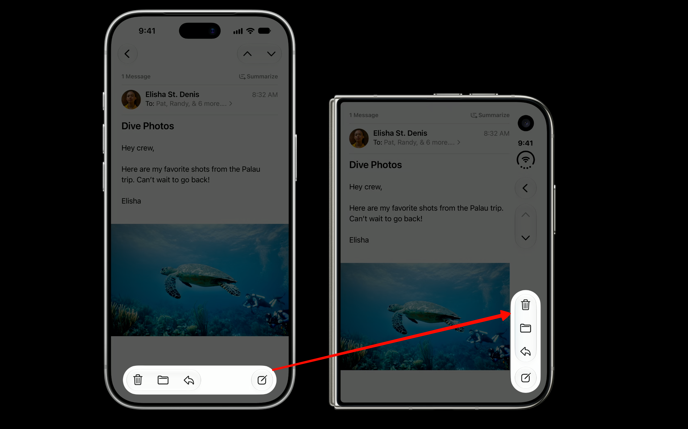
Tab bar buttons are moved to the bottom:
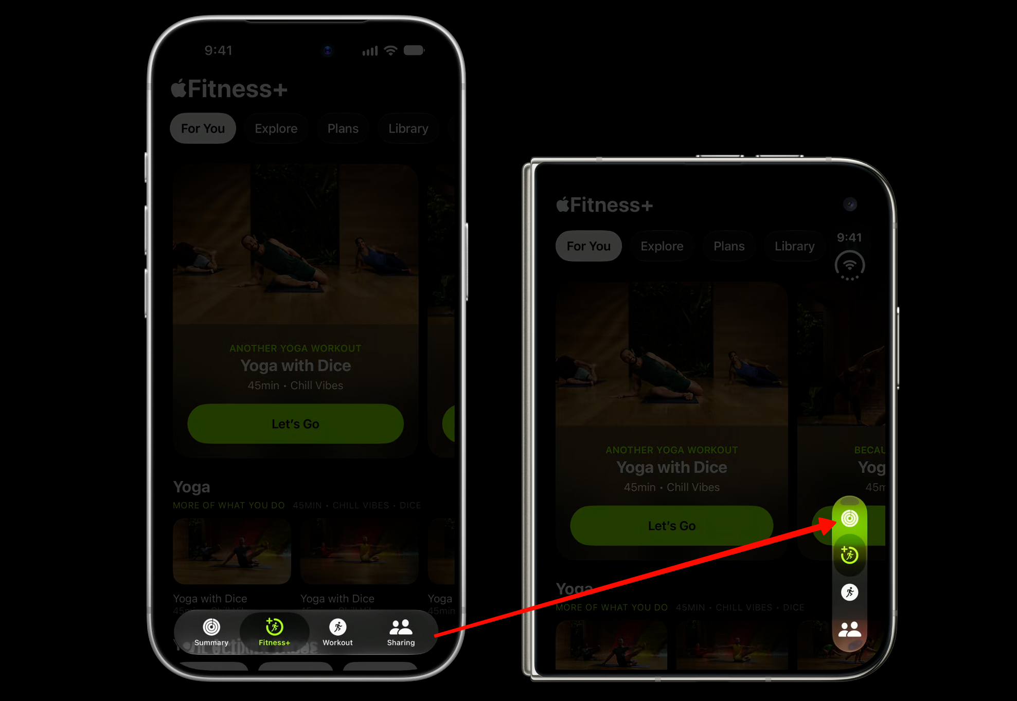
Tool bar buttons with text should stay on top:
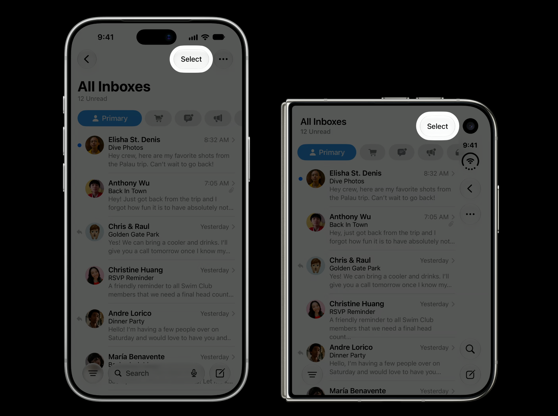
Organize & Order Bar Items
iPhone Duo allows navigation, toolbar, and tab bar controls to coexist in a shared region.
Reserve the top for primary navigation like back or close, followed by prominent actions such as done. If you are using a navigation controller, the back button is added automatically.
Use the cancellation action placement in SwiftUI, or a leading item with
leftItemsSupplementBackButtonset to false in UIKit.// SwiftUI .toolbar { ToolbarItem(placement: .cancellationAction) { ... } } // UIKit navigationItem.leftItemsSupplementBackButton = false navigationItem.leadingItemGroups = [UIBarButtonItemGroup(...)]Place prominent actions with
topBarPinnedTrailingorpinnedTrailingGroup.// SwiftUI .toolbar { ToolbarItem(placement: .topBarPinnedTrailing) { ... } } // UIKit navigationItem.pinnedTrailingGroup = UIBarButtonItemGroup(...)
Icon vs. Text-Only Items & AxisBehavior
iPhone Duo turns Horizontal bars to Vertical. Vertical bars have a fixed width and flexible item height, making them better suited to symbol-only items.
You place actions on the horizontal bar like before, and the system decides if your content is better suited on the horizontal or vertical axis. Items with an icon (i.e., back and share button) in the example below change to vertical, and the text-only items like the
Editbutton stay on the horizontal axis.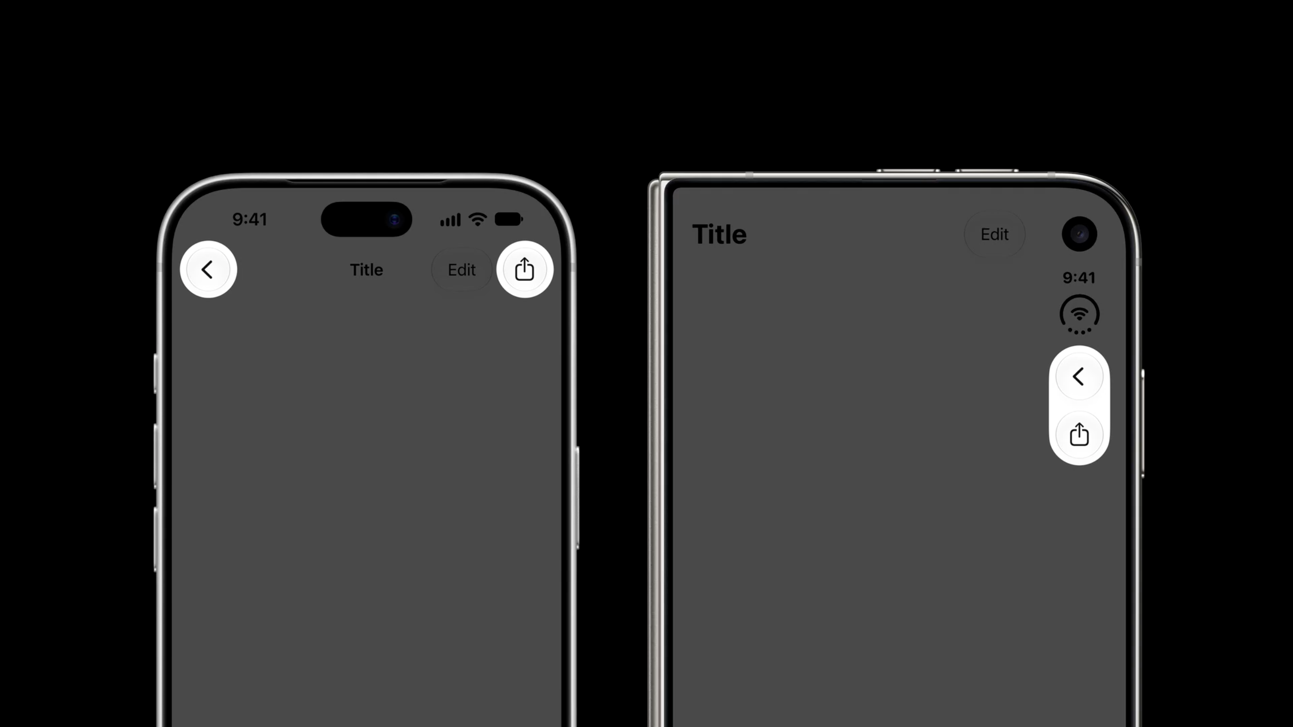
In general, you want to provide all your content with icons and then the system will decide where to place them based on content type.
Even though your content is an image, it’s still important to provide a title and the system will use it in overflow menus and expanded forms.
By default, SwiftUI and UIKit infer where to place the item based on its content, like if it’s an item that’s text only or a symbol in text. If you need to adjust this default behavior, there’s a new
AxisBehaviorAPI.// SwiftUI var body: some View { ContentView() .toolbar { ToolbarItem { ProfileView() } .axisBehavior(.verticalPreferred) } } // UIKit let item = UIBarButtonItem(customView: ProfileView()) item.axisBehavior = .verticalPreferredIf you’re creating a custom item that transitions between a symbol and a text, use the horizontal-only axis behavior:
// SwiftUI
var body: some View {
    ContentView()
        .toolbar {
            ToolbarItem {
                SelectOrDoneButton()
            }
            .axisBehavior(.horizontalOnly)
        }
}

// UIKit
item.axisBehavior = .horizontalOnly
Badges, Spacing & Overflow
Minimize title-only items or custom views that show both text and an image so more content can go vertical. Adopting the badge API added in iOS 26 will get you a system-standard badge appearance on all devices.
// SwiftUI
var body: some View {
    ContentView()
        .toolbar {
            ToolbarItem(...) {
                InboxButton()
                    .badge(7)
            }
        }
}

// UIKit
let item = UIBarButtonItem(...)
item.badge = .count(7)
Accessory bars should remain attached to the keyboard rather than moving to the vertical axis.
For custom views in particular, you might want to make changes when a vertical bar is present. To know that, read the
toolbarVerticalEdgeenvironment property or trait (not yet in Apple’s API reference — see the Raise the bar with iPhone Duo Tech Talk):// SwiftUI struct ContentView: View { @Environment(\.toolbarVerticalEdge) var edge var body: some View { switch edge { ... } } } // UIKit switch traitCollection.verticalBarEdge { ... }By default, flexible spacers are zero size in the vertical axis. But fixed spacers continue to respect their minimum size. Your app shouldn’t be creating additional spacing, regardless of whether a bar is horizontal or vertical.
Use the
toolbarCompressionBehaviorAPI (not yet in Apple’s API reference — see the Raise the bar with iPhone Duo Tech Talk) to configure your app’s preference for each view.// SwiftUI var body: some View { TabView { Tab("Recents", systemImage: "clock") { ContentView() .toolbarVerticalCompressionBehavior(.prefersToolbarItems) } } } // UIKit navigationItem.verticalBarCompressionBehavior = .prefersBarItemsIf your app already has its own overflow, consolidate its actions into a single system-managed menu. You can do that using
ToolbarOverflowMenuin SwiftUI oradditionalOverflowItemsin UIKit.// SwiftUI var body: some View { ContentView() .toolbar { ToolbarOverflowMenu { Button("Scan") { ... } Button("Connect") { ... } } } } // UIKit navigationItem.additionalOverflowItems = UIDeferredMenuElement({ provider in provider(self.persistentOverflowItems()) })Toolbar visibility priority gives you fine-grained control over which ones remain visible. By default, items overflow from bottom to top, but you can also assign each item a high, low, or custom priority to control the order in which they collapse. Use
visibilityPriorityAPIs in SwiftUI and UIKit to configure this priority.// SwiftUI var body: some View { ContentView() .toolbar { ToolbarItem { Button(...) { ... } } .visibilityPriority(.high) } } // UIKit let item = UIBarButtonItem(...) item.visibilityPriority = .high
Disabling the Vertical Bar
Most apps are good candidates for a vertical bar. However, if your app is a single-page app with a bottom-heavy layout like Calculator or if a sheet is control-heavy with only one item, consider disabling a vertical bar so it doesn’t reduce available space. Use the
toolbarVerticalBehaviorandpreferredVerticalBarBehavior(not yet in Apple’s API reference — see the Raise the bar with iPhone Duo Tech Talk) APIs to disable this.// SwiftUI var body: some View { NavigationStack { ContentView() .toolbarVerticalBehavior(.disabled) } } // UIKit class MyViewController: UIViewController { override var preferredVerticalBarBehavior: UIVerticalBarBehavior { .disabled } }
Sidebar Placement on the Inner Display
New in iOS 27, iPhone apps can also opt into sidebars by setting the tab bar controller’s
sidebar.preferredPlacementto .sidebar:// SwiftUI TabView { … } .defaultTabBarPlacement(.sidebar) // UIKit tabBarController.sidebar.preferredPlacement = .sidebarThe system determines if there is enough space to show a sidebar, for example when the horizontal size class is regular.
To determine if the tab bar’s sidebar representation can be shown, use the sidebar’s
isAvailable(tabBarController.sidebar.isAvailable) property.
Prominent Tab Bar Minimization
UITabBarController also lets you customize the prominent tab. The prominent tab is always visible, even when the tab bar collapses during scrolling. In iOS 27, you have the option to make any tab prominent by setting the
prominentTabIdentifier.// Set the prominent tab let tabs = [ // ... ] let tabBarController = UITabBarController(tabs: tabs) tabBarController.prominentTabIdentifier = "cart"Navigation bars can interactively slide away as people scroll. This provides more room on the screen for your app’s content.
You can force this behavior, one way or the other, by setting the
barMinimizationBehaviorproperty (not yet in Apple’s API reference — see the Modernize your UIKit app WWDC talk) on your navigation item to .always or .never. If you handle safe area avoidance yourself, setbarMinimizationSafeAreaAdjustmentto .never so bar minimization doesn’t update insets automatically.// Customize bar minimization behavior override init( nibName nibNameOrNil: String?, bundle nibBundleOrNil: Bundle? ) { super.init(nibName: nibNameOrNil, bundle: nibBundleOrNil) navigationItem.navigationBarMinimization.minimizationBehavior = .onScrollDown navigationItem.navigationBarMinimization.safeAreaAdjustment = .disabled }
Poses & Arrangement Views
The 6 Poses & 2 Size Classes
Your app is going to have 6 brand new configurations to support.

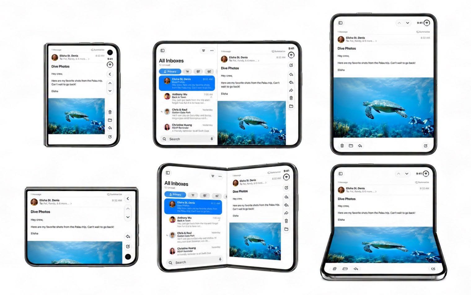
Don’t design a custom layout for each pose, instead focus on two size classes: compact and regular.
We are going to use the size classes to support the orientations: Compact width * Compact height, Compact width * Regular height, Regular width * Compact height, Regular width * Regular height.
Adapting to the Inner Display
- Here are the best options for adapting your app to the inner display:
1.) Split View
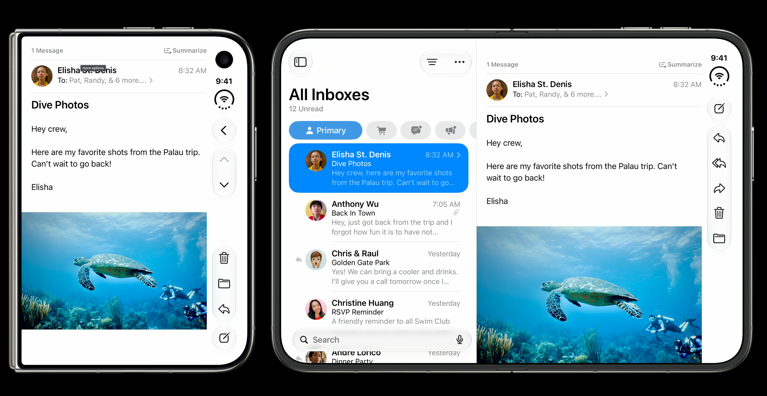
2.) Optimize your content for inner display
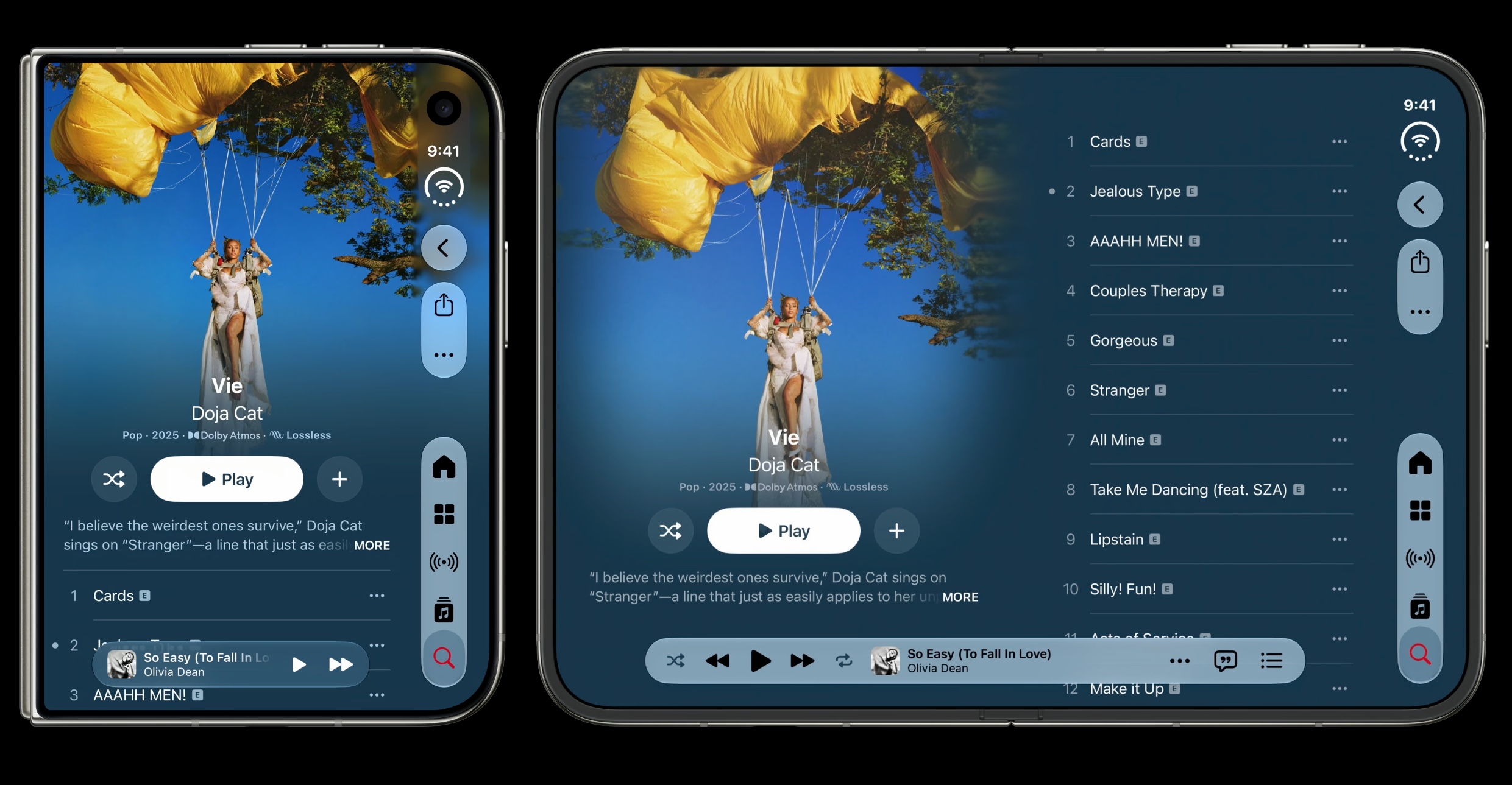
3.) Present tab bar as a sidebar in the inner display, and this is a good option for information-dense apps like the example below from Health:
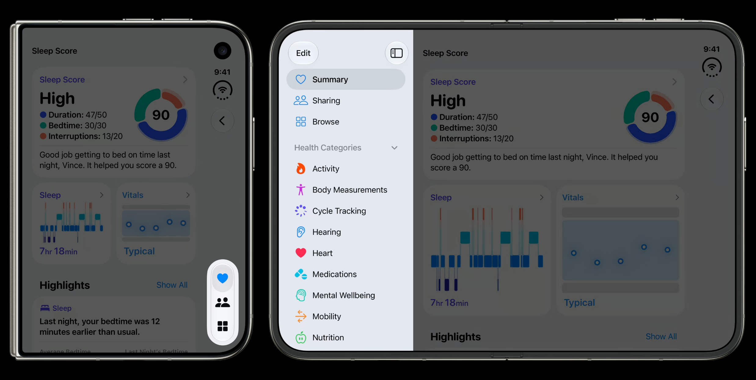
Sheets Across Poses
Here is how sheets adapt in iPhone Duo depending on the pose. Control the placement with
View.presentationPlacement(_:)in SwiftUI orUISheetPresentationController.preferredPlacementin UIKit (neither is in Apple’s API reference yet — see the Strike a pose with adaptive layouts on iPhone Duo Tech Talk).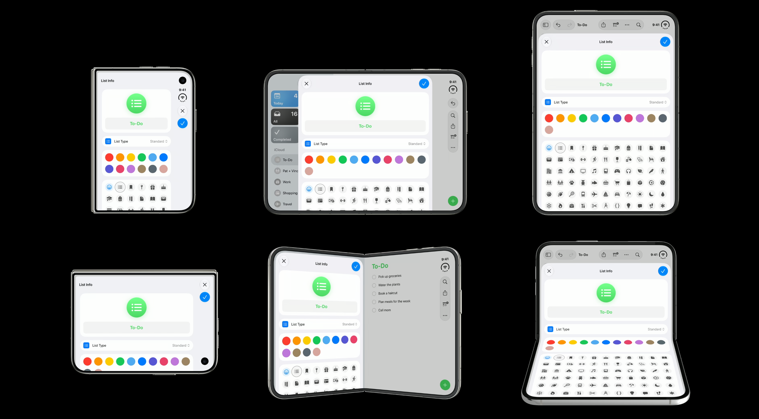
Arrangement Views
A new layout container is introduced and it sits between navigation and content containers, arranging two views according to a set of rules called an arrangement:
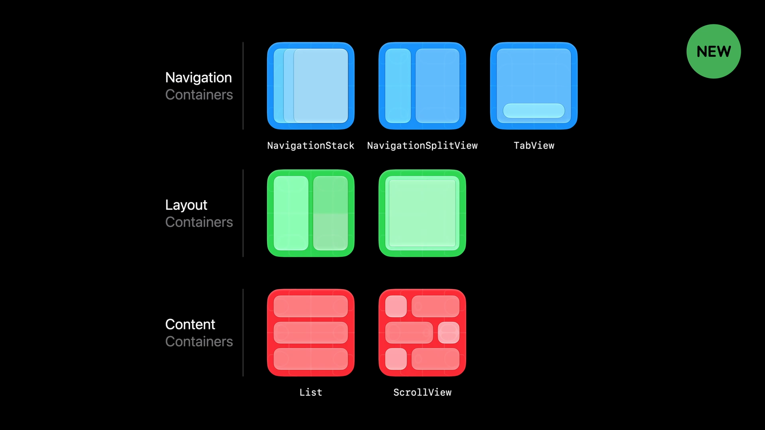
This function from inputs to outputs is called an arrangement. In iOS 27.1, you can use system-provided arrangements in your own app.
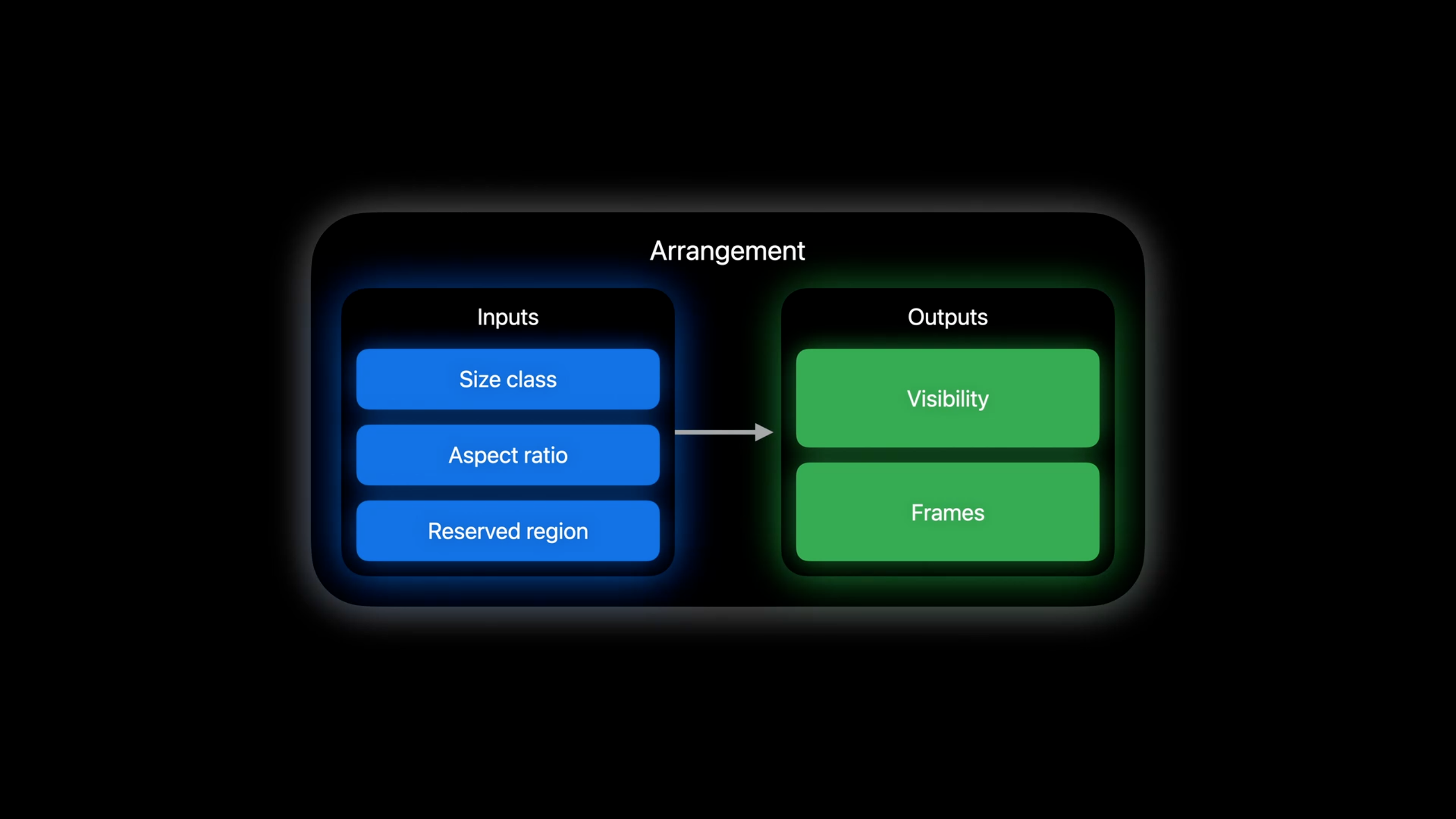
An
ArrangementViewhas different styles:
Split Arrangement
Split arrangement: positions content side by side, shows the horizontal or vertical split depending on device rotation position, if you only want to split horizontally, you can specify
axes(not yet in Apple’s API reference — see the Strike a pose with adaptive layouts on iPhone Duo Tech Talk) on split arrangement style. If the arrangement cannot be split it chooses primary view.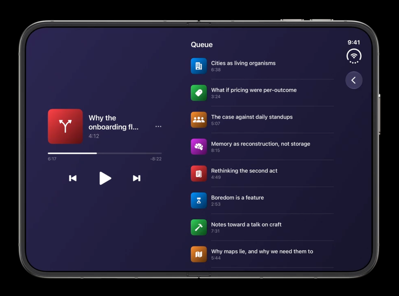
// SwiftUI
var body: some View {
  NavigationStack {
    ArrangementView {
      PlayerView()
    } secondary: {
      UpNextView()
    }
    .arrangementViewStyle(
      .split.axes(.horizontal))
  }
}

// UIKit
let arrangementVC = UIArrangementViewController()
let navController = UINavigationController(rootViewController: arrangementVC)

let playerVC = PlayerViewController()
arrangementVC.setViewController(playerVC, for: .primary)

let upNextVC = UpNextViewController()
arrangementVC.setViewController(upNextVC, for: .secondary)

arrangementVC.updateArrangement(.split.axes(.horizontal))
Overlay Arrangement
Overlay arrangement: positions content above or below each other.
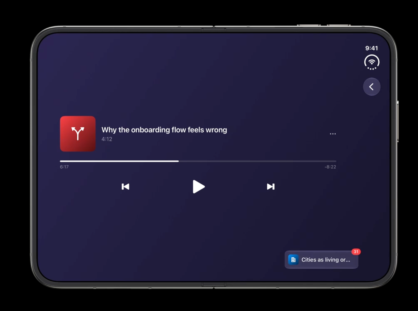
// SwiftUI
var body: some View {
  NavigationStack {
    ArrangementView {
      UpNextView()
    } secondary: {
      PlayerView()
    }
    .arrangementViewStyle(.overlay)
  }
}
If you fold the device, the overlay arrangement puts the primary and secondary arrangements side by side, which gives the UpNextView a lot more breathing room. We can query the overlay arrangement’s
overlayArrangementZIndexproperty (not yet in Apple’s API reference — see the Strike a pose with adaptive layouts on iPhone Duo Tech Talk), and the UpNextView can fold or unfold based on that zIndex property:// SwiftUI enum UpNextMinimization { case collapsed; case expanded } struct UpNextView: View { @Environment(\.overlayArrangementZIndex) private var zIndex: Int var body: some View { UpNextList(minimization: minimization) } var minimization: UpNextMinimization { zIndex > 0 ? .collapsed : .expanded } } // UIKit let arrangementVC = UIArrangementViewController() // ... let primaryState = arrangementVC.state(for: .primary) myModel.minimization = (primaryState?.zIndex ?? 0) > 0 ? .collapsed : .expanded
Choosing Between Arrangements
- First, be sure to follow your existing app patterns.
- If you’re already implementing a split-like layout in parts of your app using components like an
HStackorVStack, consider using the split arrangement. - If you’re already implementing an overlay-like layout in parts of your app using components like a
ZStack, consider using the overlay arrangement. - If you don’t have an existing pattern to lean on, consider an overlay arrangement when there’s a clear foreground/background relationship between your views.
- Consider a split arrangement when there’s more of a main-detail relationship between your content.
When Not to Use Arrangement Views
- ArrangementViews don’t provide navigation infrastructure to your app. So avoid putting navigation containers like NavigationSplitViews inside an ArrangementView. And due to the nature of views like
ListandScrollView, avoid putting ArrangementViews inside these scrollable containers.
Reserved Regions & Hinge Response
Querying Reserved Regions
Query reserved regions with
reservedRegions(kind:options:layoutDirectionBehavior:)in SwiftUI / UIKit:// SwiftUI GeometryReader { proxy in let regions = proxy.reservedRegions( kind: .division) } // UIKit let regions = view.reservedRegions( kind: .division) // Query the frame to incorporate it into your own layout let frames = regions.map(\.frame)You can include the inactive region using the
.includeInactiveoption:// SwiftUI GeometryReader { proxy in let regions = proxy.reservedRegions( kind: .division, options: .includeInactive) let frames = regions.map(\.frame) // ... }In iPhone Duo, the FaceTime camera is represented by an occlusion region. You query it by passing the
.occlusiontype. This region is active when the camera is active and inactive when the camera is inactive:// SwiftUI GeometryReader { proxy in let regions = proxy.reservedRegions( kind: .occlusion) let frames = regions.map(\.frame) // ... }
Responding to the Hinge
Your app can respond to hinge using
onHingeChangemodifier in SwiftUI andUIHingeInteraction(not yet in Apple’s API reference — see the Leverage multiple displays and scenes on iPhone Duo Tech Talk) in UIKit. Both report the high-level hinge status — closed, partially open, and fully open — as well as continuous updates of the hinge angle.- A
nullvalue for hinge indicates that app is running on a device without a hinge.
struct InstrumentView: View { /// Normalized bend, 0 is no bend, 1 is deepest bend @State private var pitchBend: Double = 0 var body: some View { GuitarView(pitchBend: pitchBend) .onHingeChange { _, context in // A null hinge means the device doesn't have one if let hinge = context.hinge, hinge.status == .partiallyOpen { pitchBend = calculatePitchBend(angle: hinge.angle) } else { pitchBend = 0 } } } private func calculatePitchBend(angle: Angle) -> Double { ... } }- A
Multiwindow & Multidisplay
Split View Multitasking
Designing for iPhone Duo multitasking:
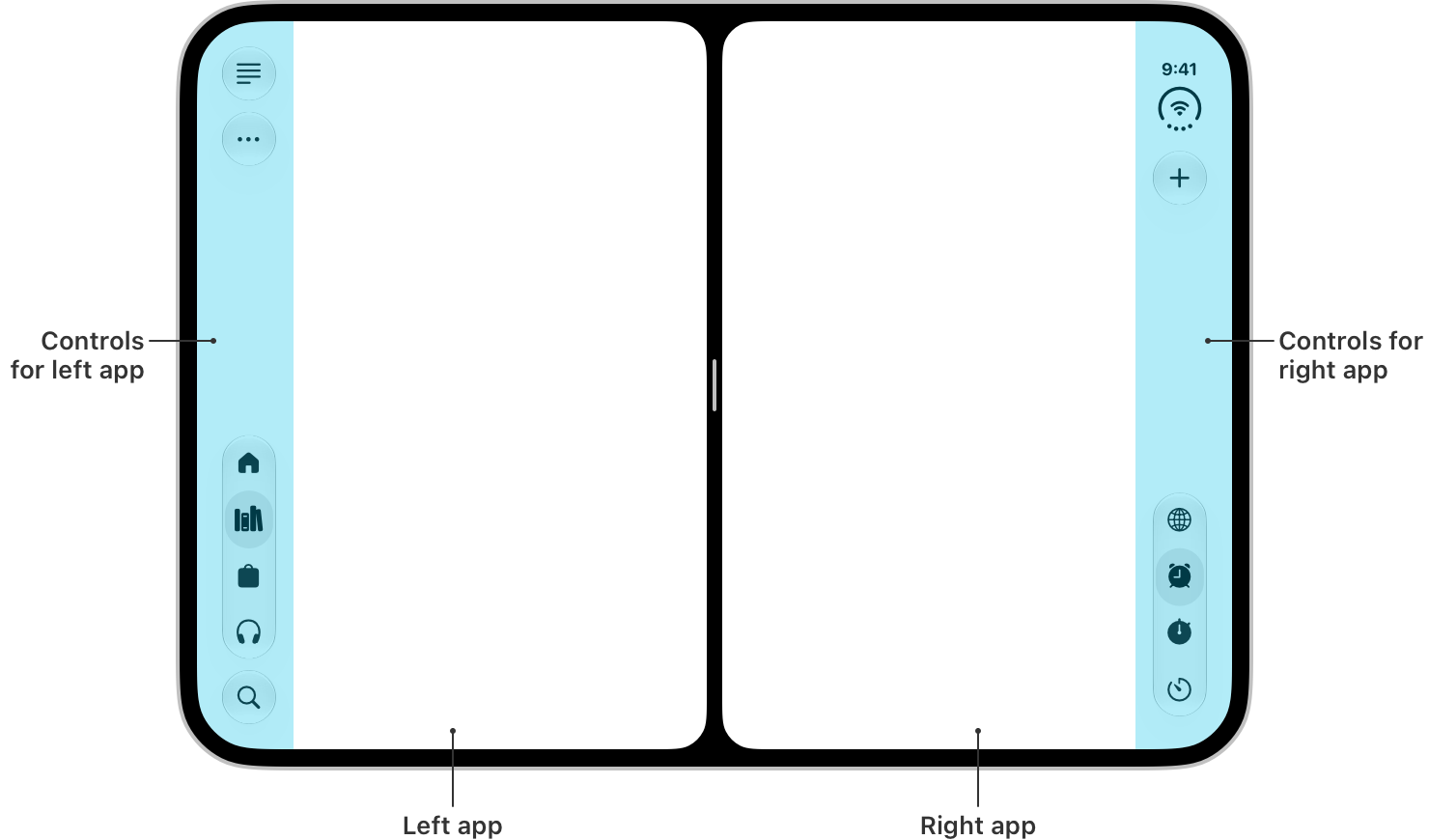
All apps support split view multitasking in iPhone Duo. If your app already supports iPad or iPhone mirroring, you are off to a great start.
iPhone Duo is the first iPhone to support multiple instances of your app’s UI. If your app supports this on iPad, it will work on iPhone Duo as well. There is one thing to keep in mind. On iPad, new windows can be created at any time. On the outer display of iPhone Duo, new windows cannot be created. That behavior is reserved for the inner display.
This dynamic availability is a behavior unique to iPhone Duo. Make sure you handle errors when requesting new scenes. Use
UIWindowSceneActivationAction, which automatically hides the button that uses it when new windows aren’t available.
Scene Accessories
Scene accessories (not yet in Apple’s API reference — see the Leverage multiple displays and scenes on iPhone Duo Tech Talk) allow your app to show content on multiple displays at the same time.
For iPhone and iPad, scene accessories give your app the ability to pair additional content with your app’s main UI, like using your iPhone as a controller for a game on an external display. They are enabled by default, but can be toggled at any time.
New for camera apps on iPhone Duo,
CameraCaptureAccessoryallows you to pair additional UI on the outer display, while your app’s main UI stays on the inner display. This lets you show content to a person while taking their photo or recording them.struct CameraRootView: View { @State private var model = TeleprompterModel() var body: some View { CameraView(model: model) .sceneAccessory { CameraCaptureAccessory(isEnabled: $model.isEnabled) { TeleprompterView(model: model) } .onAvailabilityChange { newValue in model.isAvailable = newValue } } .toolbar { TeleprompterToggle(isEnabled: $model.isEnabled) .disabled(!model.isAvailable) } } }
Camera
- iPhone Duo is the first iPhone to support two front cameras.
- Use the discovery session
AVCaptureDeviceDiscoverySessionto find the front camera. - Use the
builtInOuterUltraWideCamerato access the front camera on the outer display. - Use the
builtInInnerUltraWideCamerato access the one on the inner display. - Use the new
AVCaptureDeviceDirectionCoordinatorAPI (none of the two camera device types or this coordinator are in Apple’s API reference yet — see the Build a great camera experience for iPhone Duo Tech Talk) to manage the transition between the outer and inner cameras. - On iPhone Duo, a camera app can use both displays at once.
Migrating an Existing App
- When people use iPhone Mirroring on the Mac, they can fully resize the iPhone window, allowing your apps to resize and adapt.
- If your app is a universal binary, you are off to a great start.
- Here are the most important steps and common issues you might encounter when making your app more adaptive:
- Verifying your app is no longer using app lifecycle, and instead has adopted scene lifecycle, the basis for any adaptive app.
- Making sure your app is not using main screen references, and how to handle user interface idiom and interface orientation checks.
Scene Lifecycle
- App lifecycle to scene lifecycle (i.e., App Delegate to Scene Delegate):
- Basis for an adaptive app
- Require when linking iOS 27
Avoid Main Screen References
It is important that you do not reference the main screen in your app. Instead, access the screen dynamically from a window’s window scene.
// Use local screen references
// Access the correct screen through a windowScene
let screen = window?.windowScene?.screen

// Pass in local screen references
func generateThumbnail(_ image: UIImage, screen: UIScreen) -> UIImage {
    // existing code, replacing main screen with local screen reference
    // ...
}
Screen Geometry & Display Scale
Accessing the scale of the screen should be replaced with the trait collection’s
displayScale(traitCollection.displayScale).In places where automatic trait tracking is not available,
registerForTraitChangescan be used to observe changes.Scenes are not always full-screen.
The window scene’s effective geometry provides information on how much space your app has available. If you need to monitor the effective geometry for changes, implement
windowScene(_:didUpdateEffectiveGeometry:)in your scene delegate.// UIWindowSceneDelegate func windowScene( _ windowScene: UIWindowScene, didUpdateEffectiveGeometry previousEffectiveGeometry: UIWindowScene.Geometry ) { let geometry = windowScene.effectiveGeometry let availableSpace = geometry.coordinateSpace.bounds // ... }In your views and view controllers, instead of referencing the scene bounds, use the available size of your view controller’s view or your view’s superview to determine how much space is available to it.
// Checking available space
override func viewDidLayoutSubviews() {
    super.viewDidLayoutSubviews()

    let availableSpace = view.bounds.size
    // ...
}
For games, resizing can be challenging. Due to this,
UIRequiresFullscreenis honored on iPhone in resizable environments starting in iOS 27. Its behavior has also been updated and no longer opts your app fully out of resizing. Instead, it enables discrete resizing that honors your supported interface orientations.
User Interface Idiom & Interface Orientation
- This trait is no longer meaningful for any kind of layout decision.
- Your app is expected to use the additional space in a meaningful way, regardless of whether it is running in the phone or pad user interface idiom.
- When your iPhone app is running on an iPad or in iPhone Mirroring on the Mac, it will be fully resizable, but it will still run under the phone user interface idiom. Stop checking the user interface idiom for any layout decisions in your code.
- Use size classes instead to handle sizing constraints, such as collapsing menus and updating your app’s layout for the available space.
- Interface orientation is no longer useful for layout decisions either, and is always portrait in iPhone Mirroring. Use size classes and scene bounds instead.
Agentic Coding
- New in Xcode 27 is an app modernization skill. It has a deep understanding of the adaptivity tasks, and with the context of your project, it can make a lot of these changes automatically. Use Xcode’s intelligence features and ask an agent to make your app more adaptable.
- It will automatically convert main screen calls to traitCollection or scene bounds checks, adding invalidation logic if necessary.
- It will also replace interface orientation checks with size class checks. It will even convert your app to use scene lifecycle.
- For more complex tasks, it will ask clarifying questions. And for tasks too large to handle in a single session, it will add comments to help you keep track of the remaining work.
- And to use skills in other tools, you can export the ones Xcode uses with
xcrun agent skills export. This will create markdown files that you can then import in your workflows.
References
Design diagrams and screenshots throughout this post are sourced from Apple’s Tech Talks and design references below, unless otherwise noted.
- iPhone Duo
- Apple unveils iPhone Duo
- iPhone Duo Specs
- Design for iPhone Duo
- Designing for iPhone Duo (Human Interface Guidelines)
- Prepare your app for iPhone Duo
- Raise the bar with iPhone Duo
- Strike a pose with adaptive layouts on iPhone Duo
- Leverage multiple displays and scenes on iPhone Duo
- Build a great camera experience for iPhone Duo
- Modernize your UIKit app
- iPhone Duo Group Lab 1
- iPhone Duo Group Lab 2